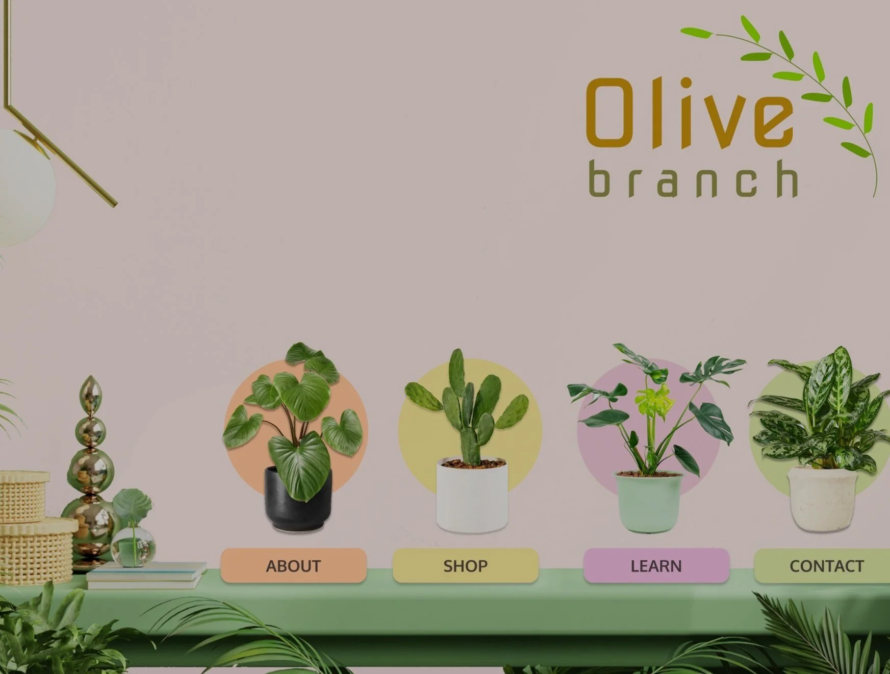
OLIVE BRANCH WEBSITE
GROUP UX CASE STUDY
OVERVIEW
Design an educational website that teaches users how to care for houseplants.
Olive Branch focuses on plant identification and plant sustainability, while providing the opportunity to purchase plants along the way of their plant learning experience.
MY TEAM
I want to give credit to my team members that I collaborated with on the Designers Group for Good Slack community. Thank you to Adil Azmi, Vincent Chang, Janeen Chavis, and Chad Greer.
MY ROLE & RESPONSIBILITIES
UX Research with initial research and findings, quantitative research, qualitative interviews, affinity mapping, empathy mapping, persona, and usability testing.
UX Design with user flow, sketching, wire framing, information architecture, prototyping, iteration, logo creation, and brand guidelines.
TOOLS
Figma, FigJam, Google Form, Google Sheets, and Usability Hub.
TIMELINE
January 2022 - May 2022
A review of houseplant websites included:
Bloomscape
Blossom
Flourish
Patch
Plants
The Sill
A review of houseplant apps included:
LeafSnap
Planta
PlantIn
INITIAL RESEARCH
INITIAL FINDINGS
Based on the website and app customer reviews, initial insights of peoples’ problems with houseplants included:
Not knowing plant names
Not having plant care instructions
Not knowing which plants blossom
Not knowing which plants have pleasant smells
Overwatering
Underwatering
Too close to air vents
Too close to heaters
Too much sun exposure
Too little sun exposure
Plants that are poisonous to pets
Plant disease or infestation
The best soil for plants
Pruning and clipping
Plant pots that are too big
Plant pots that are too small
Poor drainage
Poor rotation
No rotation
Leaf cleaning
USER RESEARCH & ANALYSIS
People were recruited from Facebook and LinkedIn. Using Google Form, we created an online quantitative survey that gauged interest, ownership, preferences, learning styles, and even the time of year they’re likely to purchase a houseplant.
From 64 respondents, our team learned that:
28.8% wanted plants that are green.
19.2% learned best from websites.
40.4% would likely buy a houseplant in spring.
36.5% would likely buy a houseplant for health purposes.
67.2% want to spend less than 30 minutes per week tending to houseplants.
Qualitative research included a questionnaire created from the online survey findings that determined 5 areas of focus:
Knowledge of plants
Preferences of plants
Interest in plants
Feelings about plants
Engagement with plants
AFFINITY MAP
We analyzed the results of the survey and used affinity mapping to group related observations. This helped us uncover the pain points users would potentially encounter as they learned about houseplants, giving us a better understanding of our audience and the website we should design.
EMPATHY MAP
From the quantitative and qualitative research, we created an empathy map to relate to what the user thinks and feels.
PERSONA
From the user research and analysis, affinity map, and empathy map, we created a persona that embodies our user.
DESIGN EXPLORATIONS
To make sure that we have properly identified the problem of users learning about and purchasing houseplants, we explore the “whys” and “what ifs” of Olive Branch in order to brainstorm and ideate our solutions-based website that will immerse users in houseplant knowledge and purchases.
INFORMATION ARCHITECTURE
Each team member was to sketch out an initial information architecture to determine how the website would work from our user’s perspective and to organize it into a readable and enjoyable format.
LOGO DESIGN
As we defined the core value for Olive Branch, we came up with different sketches of logos and later built them in Figma.
STYLE GUIDE
The style guide including our font choices and color palette that fits the purpose of the company.
SKETCHING
We each presented our sketches to decide on the layout of the website that later developed into our prototype.
FIRST PROTOTYPE
SECOND PROTOTYPE
THIRD PROTOTYPE
FINAL PROTOTYPE
USABILITY TESTING
Due to limitation of time, our team could not conduct usability testing on all components of the website. We agreed to conduct usability testing on the learning, shopping, and checkout features through Usability Hub.
USABILITY TEST - LEARNING
The learning page was built in a blog layout that could be more familiar to users and less academic than other learning platforms.
USABILITY TEST - SHOPPING
Adding items to the cart was seamless, but we also learned to separate the “Learn & Shop” pages (with the orange button shown above) because it makes shopping less confusing for our users.
USABILITY TEST - CHECKOUT
The checkout feature showcased common ways to pay without too much information cluttering the space.
USABILITY TEST - CHECKOUT CONFIRMATION
I really like that the confirmation page says “Thank You” loud and clear. Users get the feeling of gratitude along with their order number.
FINDINGS & ITERATIONS
After conducting usability testing, we summarized all the feedback and created a list of iterations for further improvements. Suggestions included:
Separate the “Learn” and “Shop” feature.
Difficult to navigate back to previous page.
Add a search function.
Add a shipping address section on the checkout page.
Some plant pictures are not aesthetically appealing.
Icons are too small and unclear.
Shopping checkout is straightforward.
Separated plant page into an e-commerce site and a learning blog.
Implemented a filtering feature that allows users to sort alphabetically.
Added search bar and search icon on each page.
Created a recently viewed section as a drop-down menu when users click on the search box.
Add login/signup function on each page.
Include a shopping cart icon.
PROTOTYPE DEMO
Click here to review the Olive Branch website prototype.
CONCLUSION & FUTURE ITERATIONS
I appreciate that I got to learn how to do product and user research, how to build a company brand and website, how to build wireframes and prototypes, why feedback on usability testing is so important, and how to collaborate with a virtual team from different locations, cultures, and professional backgrounds.
From this experience, I have decided to develop an application that will also look at how plant life affect users in outdoor spaces and what they can do to help change it.
I will lovingly call it “Olive Branch.”


