SUMMARY
Increasing the accessibility of payment assistance to low-income customers with tech limitations.
Company:
Exelon Energy
My Roles:
Research, Content, and Design
Objective:
An accessible mobile-first application.
OUTCOMES
Developed a new mobile and web payment assistance application.
$4.1M to $3.1M
$953K in debt reduction
1.3K to 3.5K
Additional customers received grants
52% to 31%
Decreased calls to the call center
48% to 76%
Application completion rate


AFTER - Payment assistance mobile application.
RESULTS
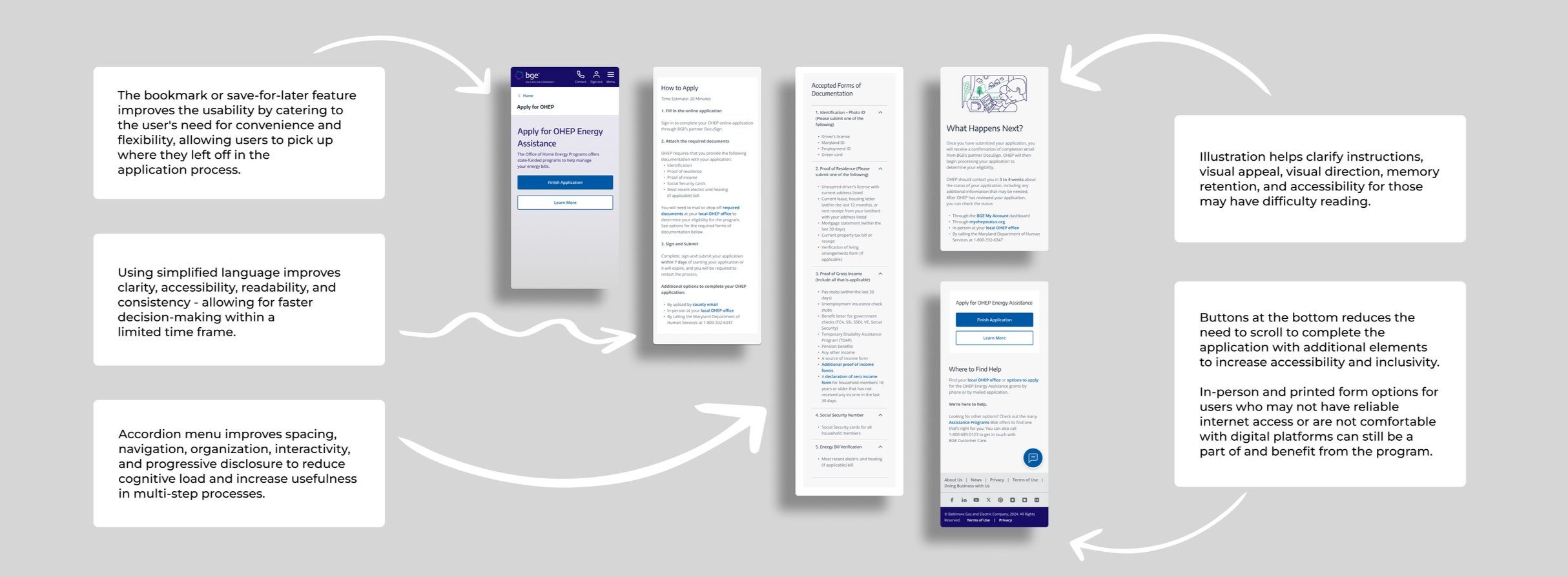
Accordion feature for space efficiency, improved navigation,
and reduced cognitive load.Streamlined a 28-page application to a 1-page process.
Save and resume function for adding documentation.
Dynamic application linked to BGE account.
Capture interface for required documents.
Direct links for additional forms.
UPDATES
To increase inclusion of low-income customers with visual difficulties, future iterations will include screen reader compatibility under WCAG standards.
OVERVIEW
Exelon, a Fortune 200 company, is the largest utility provider in the U.S., serving 9.2 million customers with natural gas, electric, and EV operation services.
ROLES
Content Designer
UX Researcher
UX Designer
UI Designer
OUTPUT
Contextual Inquiry
Visual Hierarchy
Usability Report
Content Audit
Journey Map
A/B Testing
CONTRIBUTIONS
TEAM
Stakeholders
Management
Developers
Design
Legal
TOOLS
Confluence
UserZoom
InVision
Figma
Jira
Synthesizing primary and secondary research, stakeholder guidance, customer journey mapping, branding, wireframing, prototyping, user testing, presentation design, and public speaking.

BEFORE - The OHEP online application was hosted on the State of Maryland website but was challenging for low-income, low-tech users to navigate.
USERS
BGE customers who are low-income and low-tech have limited financial resources and minimal tech experience. They often rely on mobile devices and benefit from simple, intuitive interfaces.
PROBLEM
In response to a decline in payment assistance and an increase in average handle time (AHT) to the call center, we identified barriers and created an intuitive and accessible solution to boost program engagement and the number of decrease calls.
OPPORTUNITY
Design an intuitive, mobile-optimized application that is accessible and secure, with a minimalist interface and clear support options to ensure ease of use and successful application completion to increase payment assistance and decrease call times.

BEFORE - One point of abandonment occurred at the stage of consent.
RESEARCH
primary
RESEARCH
secondary
Adaptive surveys ensured that questions were tailored to the participant's specific experiences or needs, making the research more efficient and relevant. To better understand the challenges
faced by low-income, low-technology users, I asked:
Longer customer service calls, higher application abandonment,
and more application restarts decreased payment assistance
applications, and increased business costs.

Research on poverty and the digital divide provided valuable
data on broader social issues that may have affected user
access and engagement.
Contextual interviews provided real-world insights into customer experiences and behaviors, helping to identify pain points and
areas for improvement.
Content audit with the State of Maryland OHEP Representatives helped identify existing content, ensuring it met regulatory
standards and was relevant to low-income, low-tech users.
“On a scale of 1 to 5, how difficult is it for you to use a smartphone, computer, or app in your day-to-day life?”
(1 = Very Easy, 5 = Very Difficult)
“Can you describe a time when you found it difficult to use an app,
a smartphone, or a computer?
(Branching logical question if the participant selected 4 or 5, indicating high difficulty)
"How do you feel when you experience difficulties when using an app, a smartphone, or a computer?"
(Branching logical question if the participant selected 4 or 5, indicating high difficulty)
"What do you typically do when you experience difficulty while using an app, a smartphone, or a computer?"
(To learn the participant's actions or strategies when faced with technical challenges)

Quantitative

Qualitative

Attitudinal

Behavioral
I analyzed existing data, studies, and content to gather insights and inform design decisions
to support our firsthand research.
PROBLEMS DEFINED
by the users

Difficult to Understand Language
Government jargon, unclear and all-caps content made information difficult and language inaccessible.

Mobile Usability
The application was not optimized for mobile devices, making it difficult to complete it on mobile devices.

Limited Technical Access
Low-income households are more likely
to have access to mobile devices than
desktop devices.

Confusing Navigation
Excessive navigation options, no feedback during page progression, missing progress indicators, and unclear labels.
PROBLEMS DEFINED
by the designers

Limited Feedback
Customers encountered unclear error messages leading to frustration
and drop-offs.

Complex Forms
Long, overwhelming forms led to customer abandonment and application restarts.

Hidden Functionality
Options for online submission of required documentation was hidden.

Limited Usability
Sign-up and sign-in lacks prominent placement, feedback-on-click, and accessible sizing.

Unclear CTAs
Poorly positioned call-to-actions confused customers, lowering completion rates.

Fragmented Information
Information architecture lacked intuitive or logical instruction in one location.
PROBLEMS DEFINED
by the developers

Browser Capabilities
Application did not work seamlessly across various devices and browsers.

Security Compliance
Review of program financial and personal data protection regulations were overdue.

Performance Constraints
Application load time was limited on
devices with slower internet connections.

Application Scalability
Previous application data on performance degradation was unknown.

User Authentication
Unsure of which authentication process would be best for targeted users.

System Integration
Financial systems, databases, and third-party required external team collaboration.
THE MESSY MIDDLE
partnership ambiguity
Multiple brand identities risked introducing customer ambiguity, potentially detracting from the app’s usability and cohesive design. To maintain clarity and consistency in the user experience, we opted not to include The State of Maryland's branding
in the application.
The partnership compromise was highlighted through co-branded initiatives and external communications, ensuring alignment with both stakeholder goals
and customer needs.

SOLUTION - Co-branded community events where customers could test the new application in-person.
IDEATION
DESIGN
Research insights required me to ask:
How might we be able to include new branding into the application experience?
How might we make the application language more understandable?
How might we make the onboarding process more intuitive?
How might we make help customers find the starting point?
How might we make error messages more helpful?
The insights from the contextual observation and interview with BGE customers as
they tried to navigate the State of Maryland application helped me develop a
3-step application process using plain language and clear calls-to-action.
83% of low-income, low-tech customers used Android devices, so the Open Sans font, developed by Google, was used to better sync with Google’s operating system.
The use of only primary colors for the design, buttons, and active link states was to form
visual hierarchy, lower cognitive load, and strengthen the new brand identity.
AFTER - Mobile-first design is accessible to low-income, low-tech users who rely on mobile devices as their primary or only means of accessing the internet.
USABILITY
testing

Dynamic Link
Previous bill payment assistant awardees did not know that the new application could pre-fill information from their account.

Discoverability Issue
Customers were unaware of the
new application.

Increase Visibility
Unmoderated mobile app testing showed that customers did not know where to find the new application.
DESIGN
updates

Learning Process
Customers are instructed about the new application benefits and how to
use it effectively.

Build Awareness
Customers are notified about the new application upon account sign-in.

Encourage Engagement
Customers are notified when the application period begins to increase interest and engagement with the program.

AFTER - Modal announcement and notification opt-in preference upon sign-in was critical to user participation in the new online application.
THE OUTCOMES
Debt reduction
$953K
Additional customers received grants
3.5K
31%
Decreased calls to the call center
76%
Application completion rate
RESULTS
Accordion feature for space efficiency, improved navigation, and reduced cognitive load.
Streamlined a 28-page application to a 1-page process.
Save and resume function for adding documentation.
Dynamic application linked to BGE account.
Capture interface for required documents.
Direct links for additional forms.

REFLECTION

Lessons Learned
I gained critical insights from Maryland OHEP representatives and low-income
BGE customers only after building
strong stakeholder relationships.

Next Steps
In order to better accommodate low-income customers with visual disabilities, future improvements will have screen reader compatibility under WCAG standards.