Gesture-controlled LED indicator using
Arduino to explore conceptual design.

OUTCOMES
EXELON
BRIEF
Exelon, a Fortune 200 company, is the largest utility provider in the U.S., serving
9.2 million customers with natural gas, electric, and EV operation services.
In response to a decline in payment assistance, we identified process barriers and created a more intuitive, accessible solution to boost program engagement.
ROLE
UX Designer
Content Designer
UX Researcher
DELIVERABLES
Contextual Inquiry
Visual Hierarchy
Usability Report
Content Audit
Journey Map
A/B Testing
TEAM
External Stakeholders
Program Manager
Product Manager
UX Design Lead
UI Designer
Developers
Legal
TOOLS
TIME
Confluence
InVision
4 Months
Figma
Jira
Bad debt reduction by the end of Q1 2024
Application completion rate
Decreased calls to the call center
Additional customers received grants
76%
31%
953K
1.3K
RESEARCH
IDEATION
The collaboration between the program manager, product manager, design lead and the legal team was to ensure that our exploration was comprehensive and aligned with both customer needs and business goals. The research was in multiple phases:
A content audit with the State of Maryland OHEP representatives.
A journey map of the application process and pain points.
Contextual interviews with BGE customers.
Pew Research Center on poverty.
Our research insights required us to ask:
How might we make the application language more understandable?
How might we make the onboarding process more intuitive?
How might we make help customers find the starting point?
How might we make error messages more helpful?

PROBLEMS DEFINED
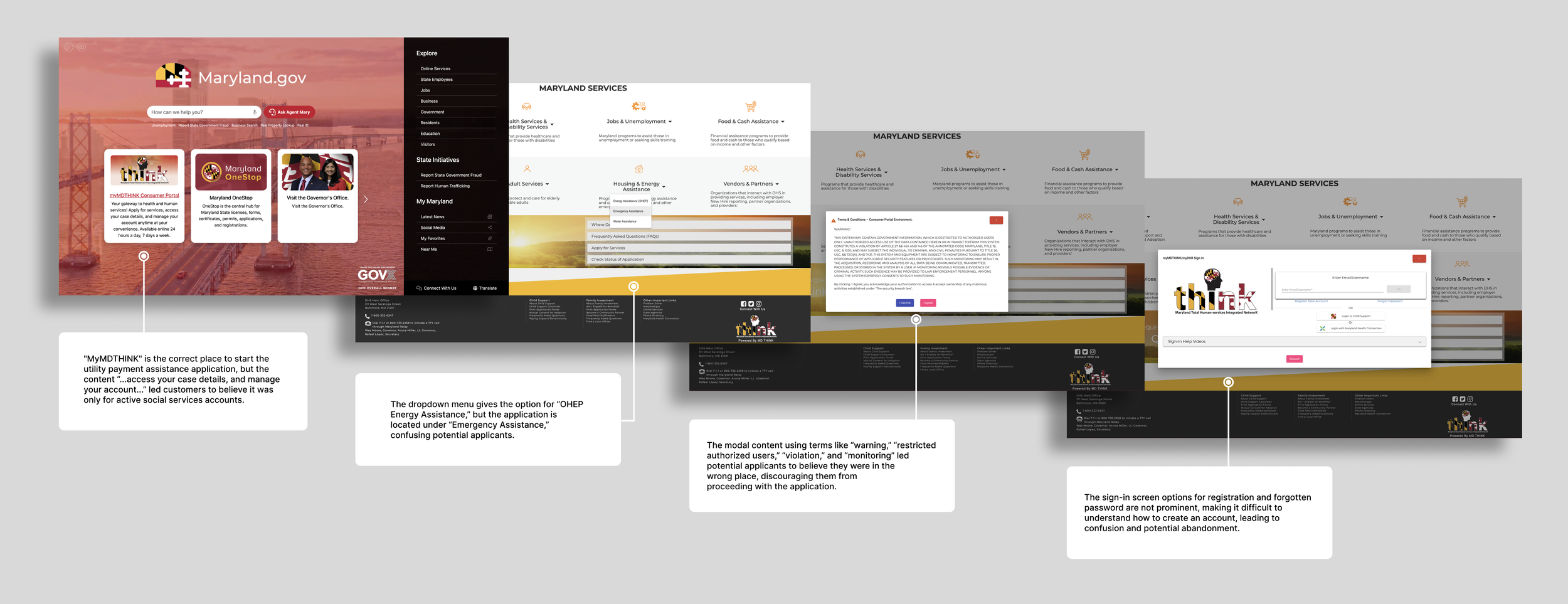
Difficult to Understand Language
Government jargon, unclear explanations leads to misunderstandings, making it inaccessible. All-caps content makes the application’s tone unfriendly.
Limited Technical Access
Low-income households are more likely to have access to mobile devices than desktop devices.
Confusing Navigation
Too many navigation options, lack of feedback at page progression, no progress indicators, ambiguous labels, and low contrast colors.
Limited Feedback
Customers encountered unclear error messages leading to frustration
and drop-offs.
Mobile Usability
The application was not optimized for mobile devices, making it difficult to complete the application on mobile devices.
Complex Forms
Long and confusing forms were overwhelming, causing customers to abandon
the application over 7 days, requiring customers to restart the process.
Unclear CTAs
Poorly positioned call-to-actions made it difficult for customers to understand
how to proceed, reducing completion rates.

More customer service calls
Task completion rates
Minutes on task
App drop-off rate
KEY METRICS
67%
21%
12
41%

DISCOVERY
DESIGN
Content strategy incorporated business objectives for increased fund allocation, compliance, and trust. BGE customers need critical information early. Providing simple, action-oriented language that can help them quickly locate key details, requirements, and deadlines—reducing errors and improve data accuracy.
Of the 28-page application, the identified sections where customers frequently disengaged or need additional clarification was:
Options for submitting required documentation
How to sign up or sign in to the platform
How much documentation is required
The user experience design strategy focused on simplifying the application's logic to create a clear, intuitive flow. To minimize cognitive load, I broke the application instructions to 3 manageable steps, using plain language and clear calls-to-action.
The insights from the contextual observation and interview with BGE customers as they tried to navigate the State of Maryland application helped me:
Develop a prototype
Conduct A/B testing
Create refinements

USABILITY TESTING
DESIGN IMPROVEMENTS
We recruited 17 BGE customers who were previous bill payment assistance awardees and conducted unmoderated mobile app testing through
UserZoom. In addition, we conducted remote contextual inquiries
that showed that we met our usability goals, but we found that:
We needed a strategic approach to increase visibility and awareness.
Customers did not know that it was linked to their BGE account.
Customers were unaware of the new OHEP application.
Based on these findings, we had to create a modal enhancement to:
Ensure that they would be notified when the application opened.
Learn about its benefits and how to use it effectively.
Build customer awareness upon account sign-in.

Bad debt reduction by the end of Q1 2024
Application completion rate
THE RESULTS
We reduced a lengthy 28-page barrier to a simple 1-page process.
Save and resume function, as customers need additional time to gather documentation.
Accordion feature for space efficiency, improved navigation and reduced
cognitive load.Dynamic application linked to BGE account.
Capture interface for required documents.
Direct links for required forms.
Decreased calls to the call center
Additional customers received grants
THE OUTCOMES
76%
31%
953K
1.3K
REFLECTION

Lessons Learned
Obtaining critical insight from the State of Maryland OHEP representatives and
low-income BGE customers took
place after I successfully built
stakeholder relationships.

Next Steps
In order to better accommodate low-income customers with visual disabilities, future improvements will have screen reader compatibility under WCAG standards.